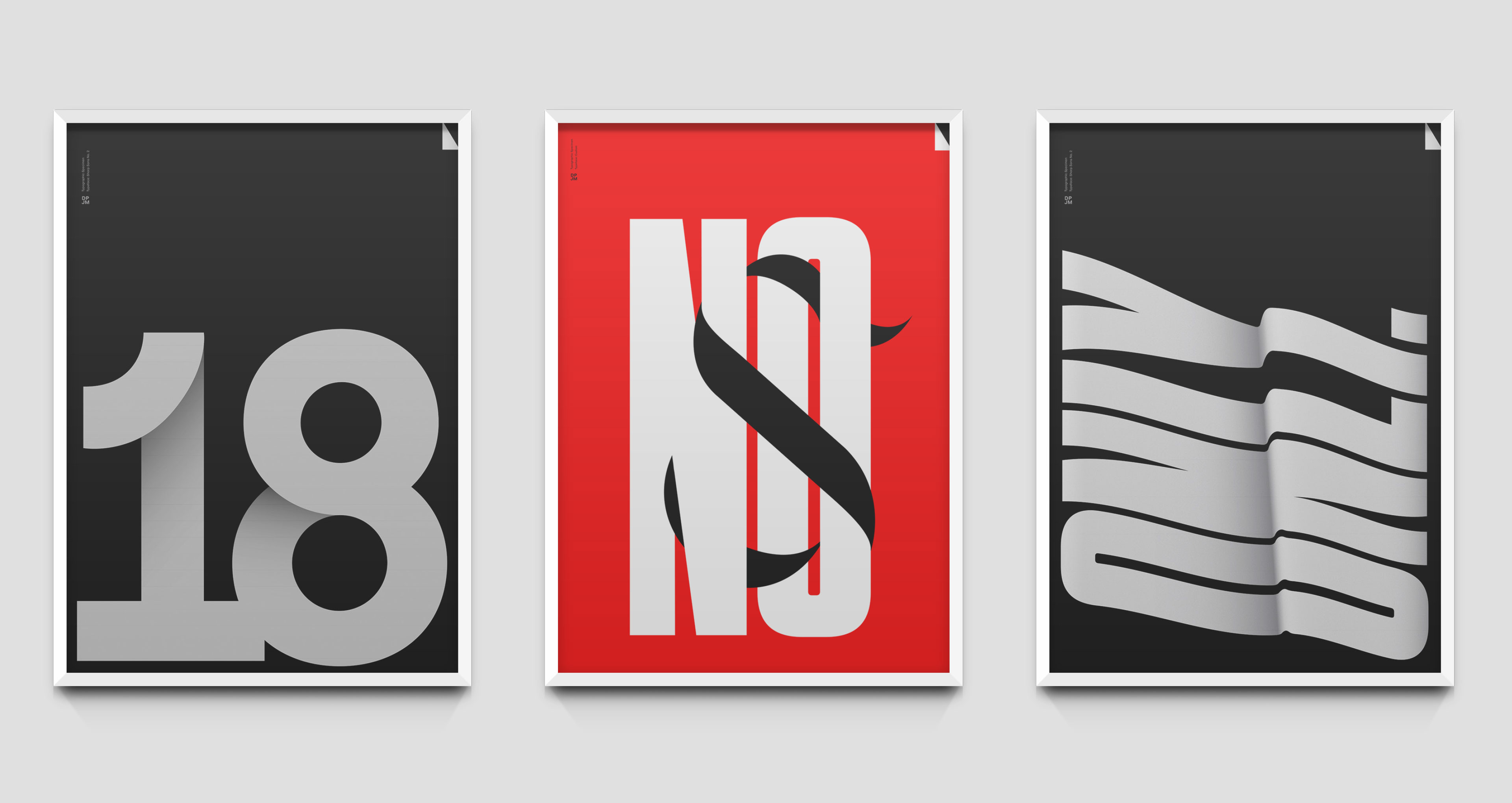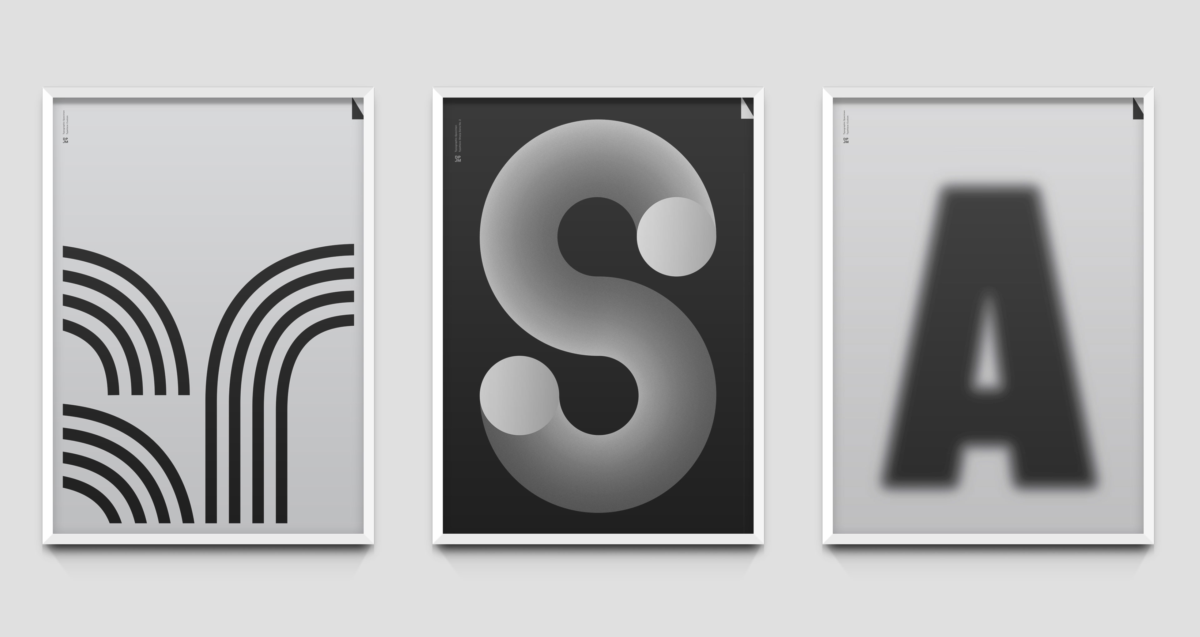


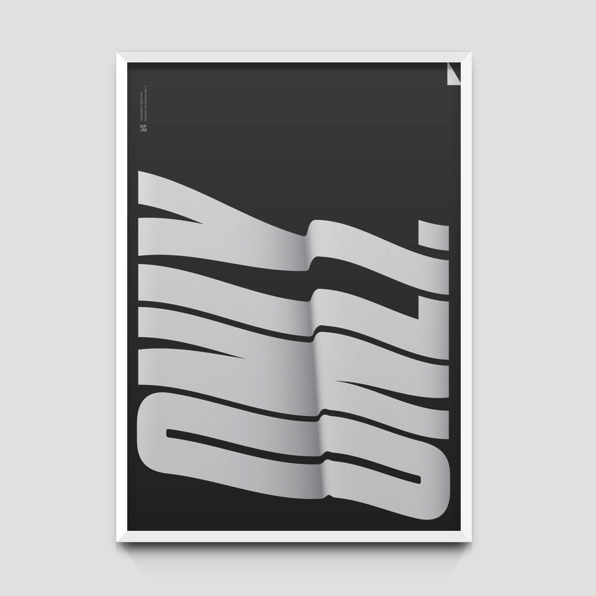
I was asked to participate in an exhibit featuring other designers and illustrators. I was interested in abstracting typographical forms by removing any coherent message so that the viewer could focus only on type itself. I used a very limited color palette as well as overlays and gradients and developed six prints for the show.
More info here.
Type Design
Design
Poster Design